Data Preparation
Load the dataset and adjust outliers in IC50 values. Replace any value of 1000 in the IC50 column with a calculated outlier value.
data <- readxl::read_excel("ic50.xlsx", sheet = 2) %>% rename(IC50 = colnames(.)[6])
outlier <- (data$IC50 %>% sort(decreasing = TRUE) %>% nth(2)) * 1.1
data$IC50[data$IC50 == 1000] <- outlier
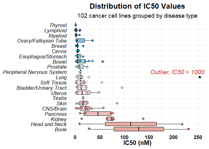
Plot 1: IC50 Distribution by Tissue
We plot the IC50 values grouped by tissue type, applying a color gradient based on unique tissue values. Outliers are displayed as black points, with a label.
# Define color palette
col <- colorRampPalette(colors = c("royalblue3", "deepskyblue3", "white", "lightpink2", "tomato3"))(length(data$Tissue %>% unique()))

# Generate the plot
ggplot(data %>% filter(IC50 != outlier), aes(x = reorder(Tissue, -IC50, FUN = median), y = IC50, fill = reorder(Tissue, IC50, FUN = median))) +
  geom_boxplot(outlier.shape = NA, alpha = 0.5, color = "black") +
  geom_jitter(width = 0.1, size = 2, shape = 21, color = "black", alpha = 0.9) +
  scale_fill_manual(values = col) +
  scale_y_continuous() +
  labs(title = "Distribution of IC50 Values",
       subtitle = "102 cancer cell lines grouped by disease type",
       x = NULL,
       y = "IC50 (nM)") +
  theme_minimal(base_size = 14) +
  theme(
    plot.title = element_text(face = "bold", hjust = 0.5, size = 18),
    plot.subtitle = element_text(hjust = 0.5, size = 14),
    axis.text.x = element_text(angle = 0, size = 12, color = "black", face = "bold"),
    axis.text.y = element_text(angle = 0, size = 13, hjust = 1, face = "italic", color = "black"),
    axis.title.x = element_text(margin = margin(t = 0), face = "bold", size = 15, color = "black"),
    axis.title.y = element_text(margin = margin(r = 0)),
    legend.position = "none"
  ) +
  coord_flip() +
  geom_point(data = data %>% filter(IC50 == outlier), size = 3, shape = 21, fill = "black", color = "gray", alpha = 0.9) +
  ggrepel::geom_text_repel(data = data %>% filter(IC50 == outlier), label = "Outlier, IC50 > 1000",
                           fontface = "italic", color = "brown3", size = 5, nudge_x = 1)

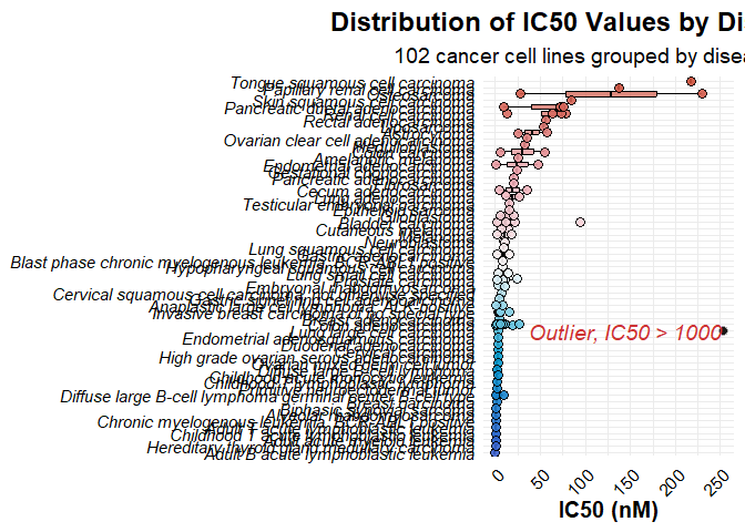
Plot 2: IC50 Distribution by Disease Type
This plot displays IC50 values grouped by disease type, with a similar color gradient based on unique disease values.
# Define color palette
col <- colorRampPalette(colors = c("royalblue3", "deepskyblue3", "white", "lightpink2", "tomato3"))(length(data$Disease %>% unique()))

# Generate the plot
ggplot(data %>% filter(IC50 != outlier), aes(x = reorder(Disease, IC50, FUN = median), y = IC50, fill = reorder(Disease, IC50, FUN = median))) +
  geom_boxplot(outlier.shape = NA, alpha = 0.7, color = "black") +
  geom_jitter(width = 0.1, size = 3, shape = 21, color = "black", alpha = 0.9) +
  scale_fill_manual(values = col) +
  scale_y_continuous() +
  labs(title = "Distribution of IC50 Values by Disease Type",
       subtitle = "102 cancer cell lines grouped by disease type",
       x = NULL,
       y = "IC50 (nM)") +
  theme_minimal(base_size = 14) +
  theme(
    plot.title = element_text(face = "bold", hjust = 0.5, size = 18),
    plot.subtitle = element_text(hjust = 0.5, size = 14),
    axis.text.x = element_text(angle = 45, size = 12, hjust = 1, color = "black"),
    axis.text.y = element_text(angle = 0, face = "italic", color = "black"),
    axis.title.x = element_text(margin = margin(t = 0), face = "bold", size = 15, color = "black"),
    axis.title.y = element_text(margin = margin(r = 0)),
    legend.position = "none"
  ) +
  coord_flip() +
  geom_point(data = data %>% filter(IC50 == outlier), size = 3, shape = 21, fill = "black", color = "gray", alpha = 0.9) +
  ggrepel::geom_text_repel(data = data %>% filter(IC50 == outlier), label = "Outlier, IC50 > 1000",
                           fontface = "italic", color = "brown3", size = 5, nudge_y = -10)
